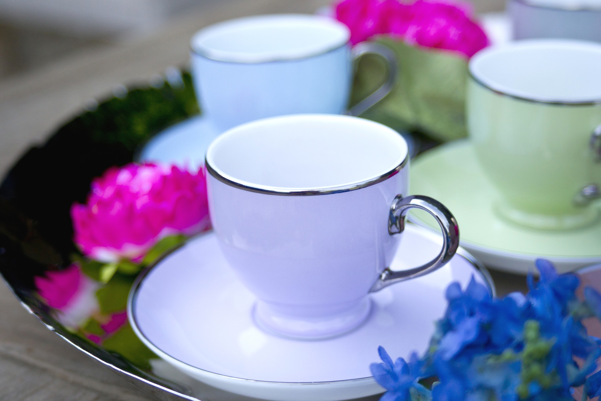
The most daring yet effective use of pastels that 2016 has seen is colour clashing. Despite previously being considered as garish and dated, combining colours has taken as super stylish turn. Make sure you mix colours within a similar palette – baby blue, cotton candy pink, lavender and pale lemon shades complement each other perfectly. If you want to really commit to this trend, paint wooden barstools a variety of shades to brighten up your breakfast bar, or keep your clashing low-key by using mismatched pastel tableware.
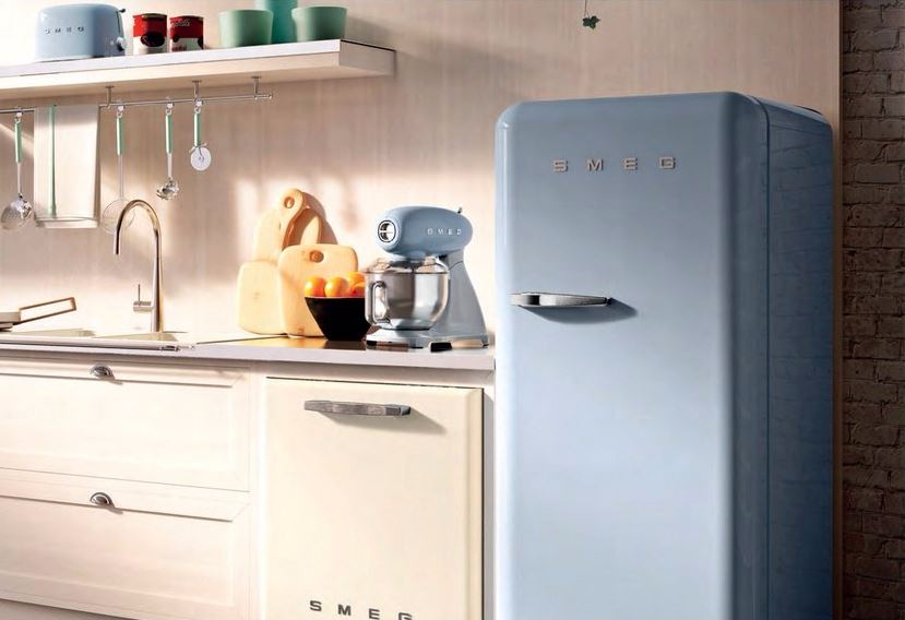
Scandinavian minimalism has been hugely popular in the interior world over the last decade. However, despite the craze for understated style and monochrome colour palettes, designers and homeowners alike are increasingly opting to add a pop of pastel colour. With an overly muted colour scheme, designers run the risk of creating an environment that is dull or uninspiring. Maintain the peace and clarity offered by a minimalist kitchen whilst incorporating eclectic accents such as pastel pink appliances, or a statement baby blue fridge. Alternatively, use soft furnishings like cushions and throws in vibrant and uplifting shades to create a colourful yet stylish lounge.
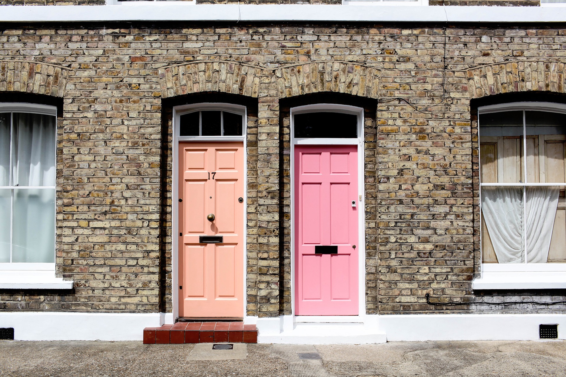
Pastel colours have had their ups and downs in the history of interior design, but their glory days can arguably be found in 18th century Paris. Marie Antoinette was known for her decadent styling and a clashing combination of baby pink and forest green, whilst Madame de Pompadour’s affinity for rosey pastels was so well-established that the shade became known as Pompadour pink. Create a luxury look reminiscent of this era by combining delicate pastels with Baroque-inspired lamps, cushions or even statement Baroque wallpaper. Vintage inspired accessories such as elegant door knobs are a perfect way to complete the look.
Whether you want an interior that is eclectic, luxurious or sleek, pastel shades can help you create a look you’ll love.