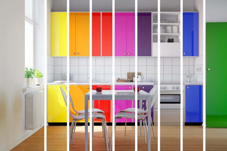
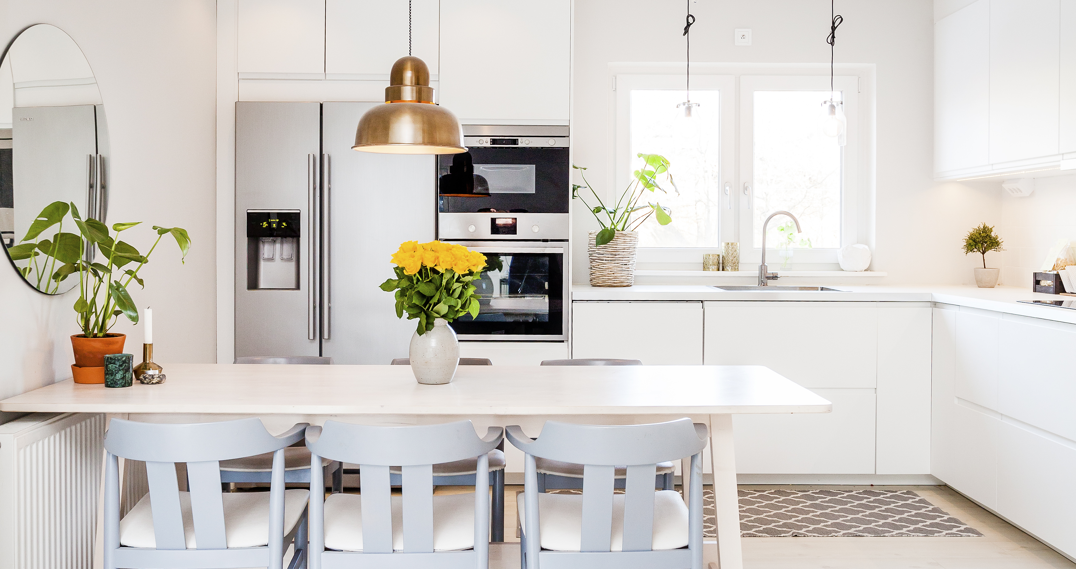
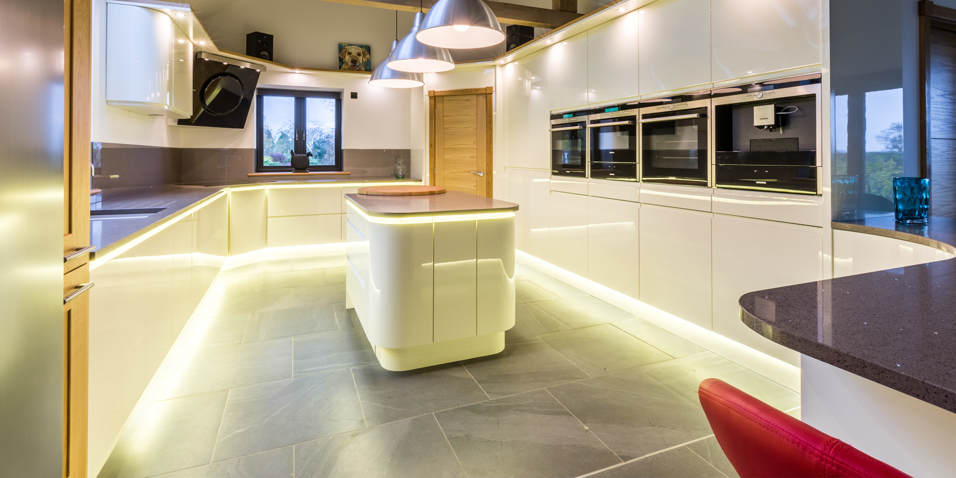
White (or light, neutral colours)
A predominantly white, or light-coloured, kitchen will give the impression that your room is flooded with light, making it an inviting space that people want to spend time in. Because it creates such a welcoming effect, this colour scheme is perfect if you want your kitchen to be the social hub of the home.
White and/or cream is a versatile colour scheme for your kitchen. Light, neutral colours are sophisticated, work really well for both traditional and contemporary design schemes and can be tailored to suit your personal taste. They work equally well as a blank canvas on which pops of accent colour can be layered, or as an accenting colour for bolder colour combinations.
It’s worth bearing in mind is that white and light colours show up any spots, stains or scuffs particularly harshly, so it may not be the ideal colour scheme if you’re looking for a lower maintenance kitchen.
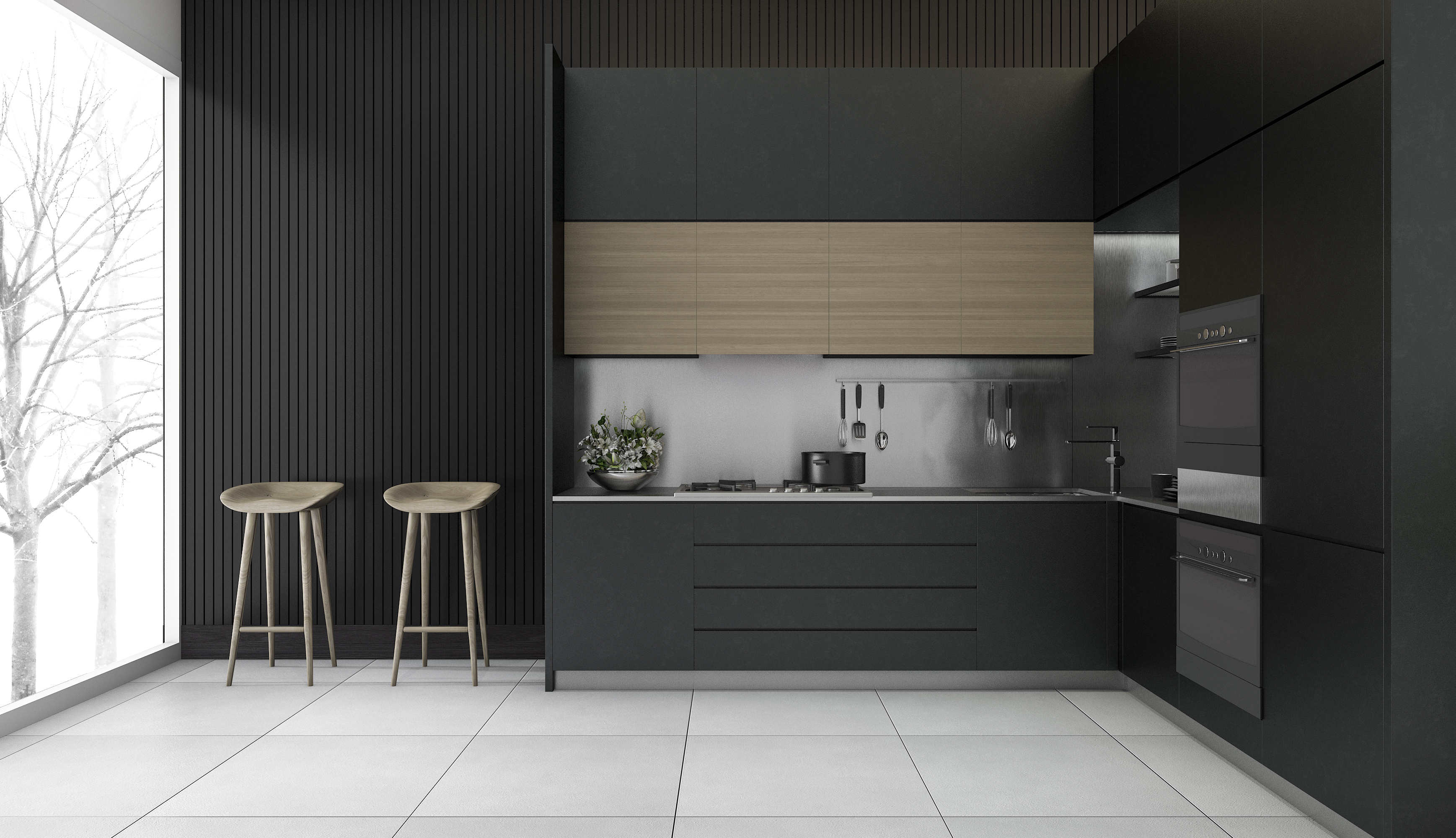
Black or Grey
A black or dark grey kitchen can look wonderfully sleek and elegant. Grey is particularly on-trend at the moment, giving a new and interesting take on neutral. However, a black or dark grey colour scheme can be difficult to pull off, it’s a bold option for the daring homeowner.
In order to do a dark kitchen well, you need to think about injecting some variety in other ways. For example, consider letting texture do the talking; a mix of glossy and matte finishes, or materials such as wood and slate, would introduce an interesting element of contrast.
Or you could choose black or grey as one element of a contrasting colour scheme; teaming black units with white flooring, for example, can create a brilliantly sophisticated look. Bear in mind that black in particular can be an aggressive combination with other colours, and risks looking cartoonish when paired with brights like red, orange or yellow. For a guaranteed, sophisticated look, pair black with white, neutrals and metallics.
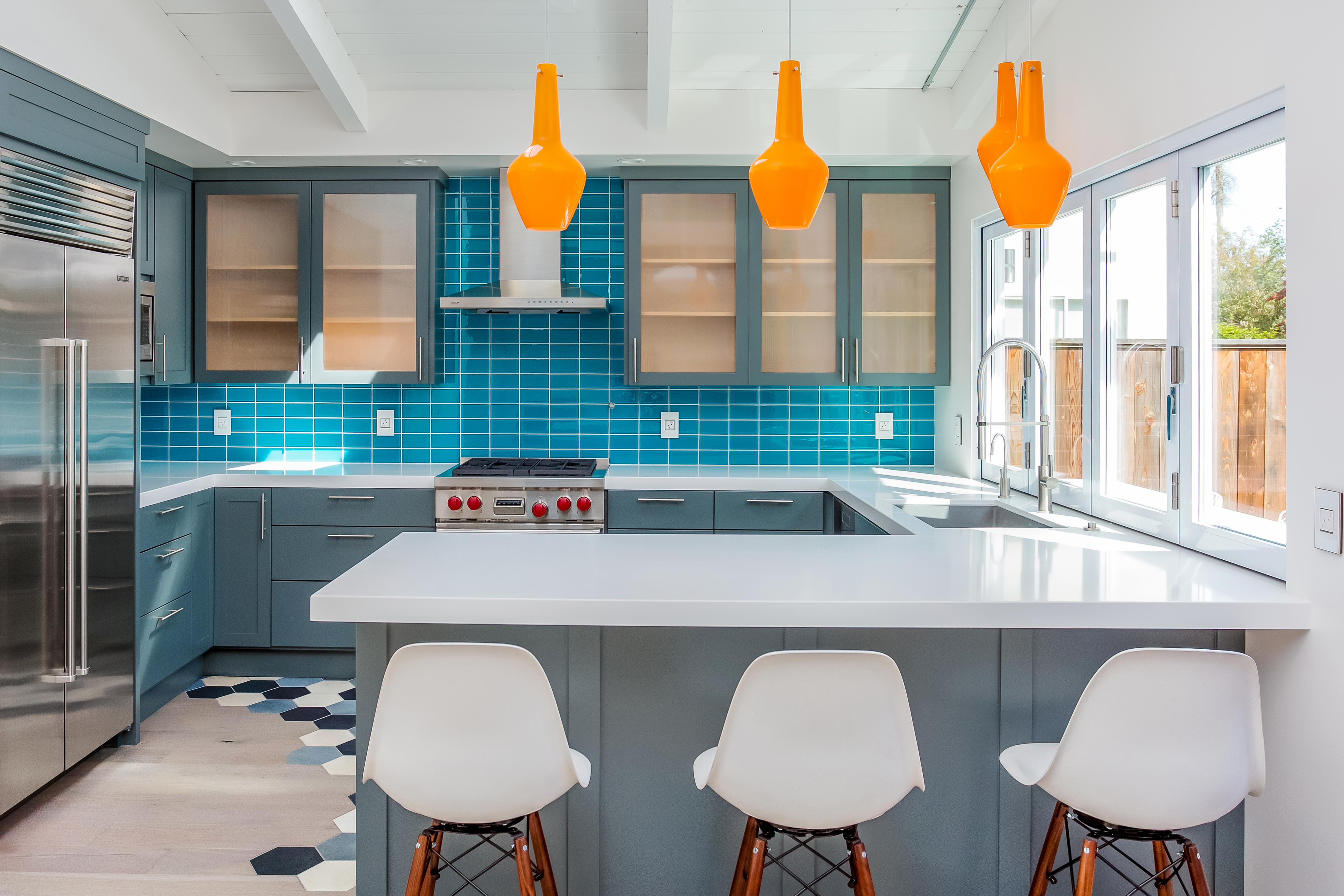
Blue
Blue is also enjoying something of a moment right now, and it’s not hard to see why. Wonderfully calming, with a wealth of tones ranging from navy to cornflower to duck egg, blue is certainly a comforting, peaceful and supremely versatile choice.
On-trend darker hues are great for injecting some sophisticated drama into a space, and work well with stand-out accessories such as copper or brass handles, statement, patterned tiles, and white marble. Pretty, pastel tones look beautifully fresh, and work well teamed with white in a country or nautical-inspired kitchen.
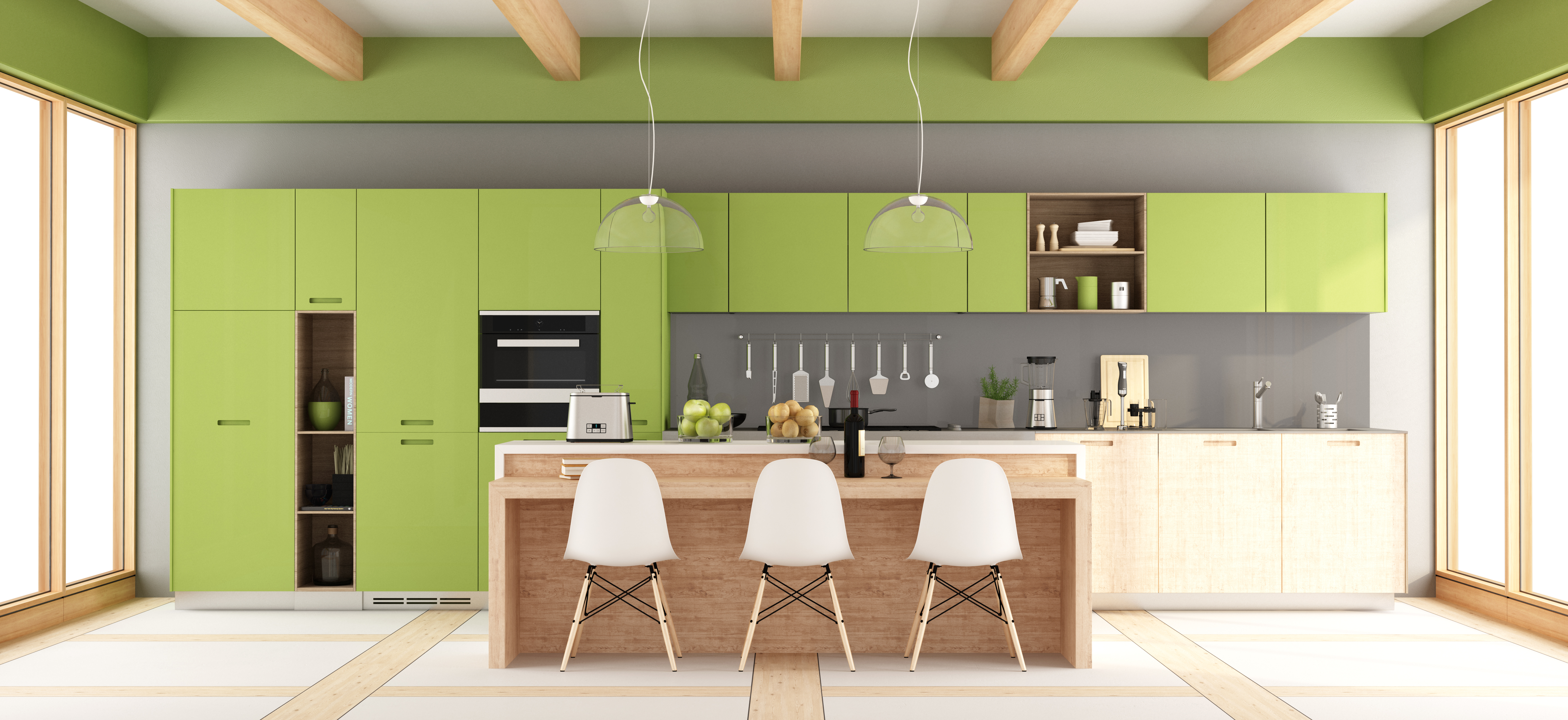
Green
Green is another relaxing kitchen colour choice- the ideal antidote to any cooking stresses! The colour of nature, it suggests harmony and balance and works particularly well with natural materials such as solid wood, stone and glass. It’s also extremely versatile, with a wealth of hues including sage, teal, apple and moss available to play with. Consider green if you’re going for a farmhouse kitchen- it’s the perfect colour choice for bringing a little of the outside indoors.
Yellow
The colour of happiness, which has been shown to improve mental focus, yellow may not be such an obvious choice for a kitchen- but do it right and it can look amazing.
Pale buttermilk and flax shades can create a beautiful, fresh and subtle look, whereas bolder shades add lashings of drama. Deep, warm yellows work particularly well in Mediterranean or adobe-style kitchens, conjuring up the feeling of some serious sunshine.
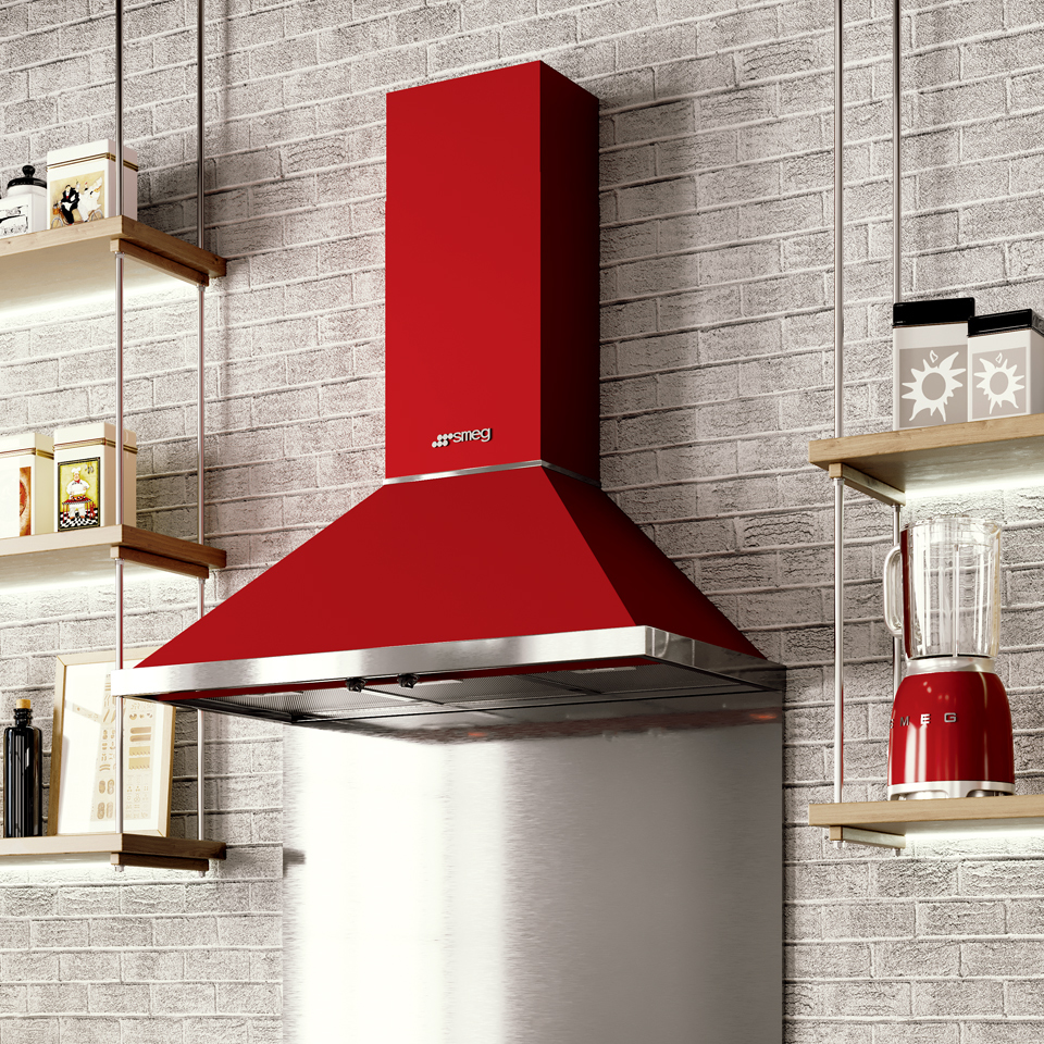
Red
Again, red might not immediately spring to mind when you think of kitchens, but it’s a hue that can make an impactful style statement. From crimson, to berry, to daring scarlet, there are a variety of shades to choose from- so you can ensure you create a room that’s right for you.
To avoid an overly dramatic, or claustrophobic look, (red is a colour that draws the eye in, so can make rooms look smaller,) consider choosing red as your statement accent colour. Try incorporating it into your design using clever, stand out accessories such as red cookers, cooker hoods, kettles and toasters. Alternatively, you could offset larger red areas, e.g. cabinetry, with more soothing colours like white, to minimise its fierce impact.
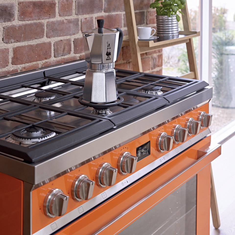
Orange
There’s no denying it- orange is a seriously bold choice for a kitchen colour scheme. But that’s not to say it can’t be successfully incorporated into your kitchen.
One of the colour wheel’s most stand-out shades, orange is a stimulating colour that gives the impression of warmth and is reported to increase the oxygen levels in our brains.
Orange works fantastically as a striking colour choice, which is guaranteed to create a real statement, but is less easy to work with if you’re craving a subtler look. Try peach or terracotta shades for a muted take on the colour. Or, as with red, consider introducing orange as an accent colour through the clever use of accessories or statement appliances for a manageable take on this boldest of hues.
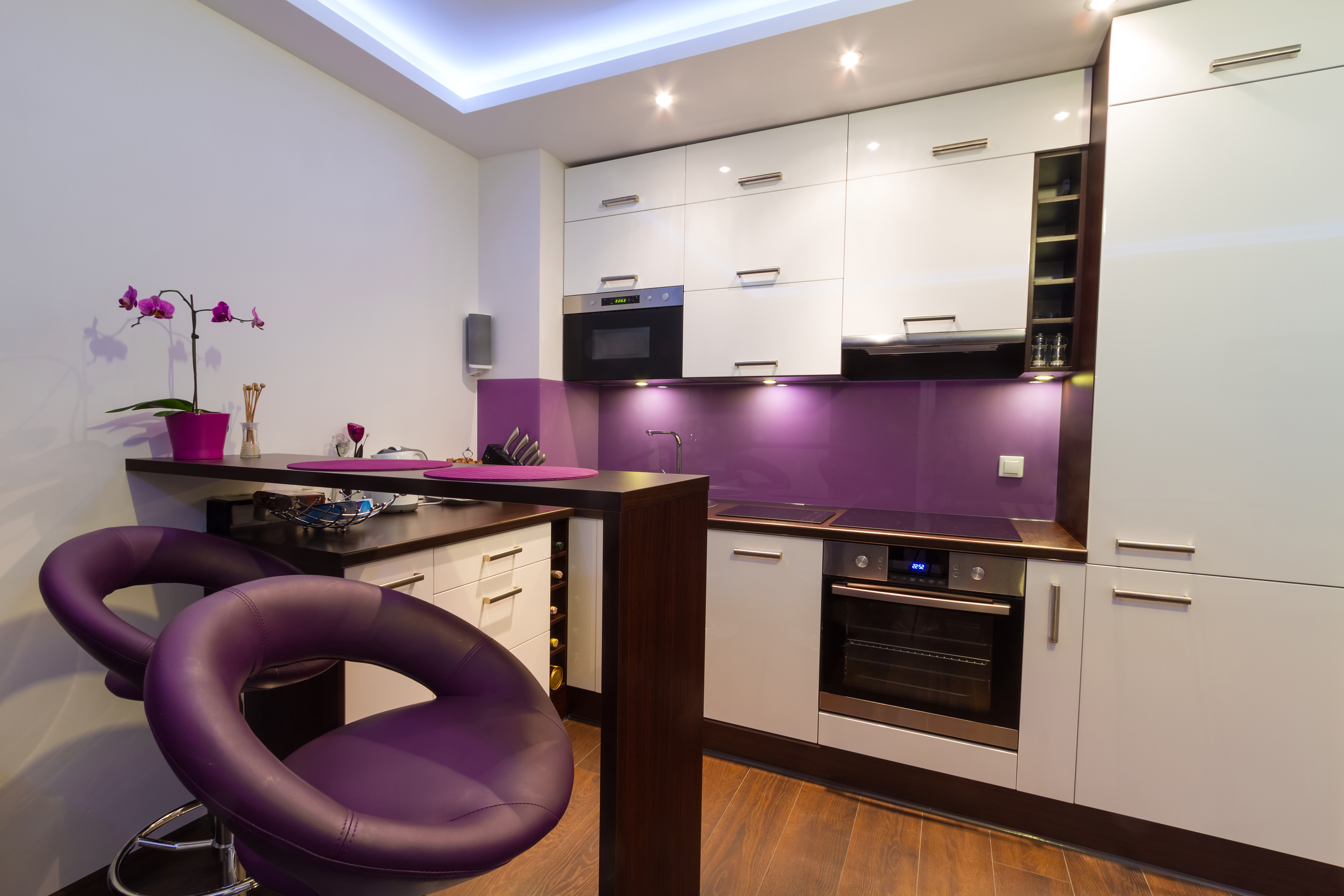
Purple
Purple is possibly one of the most unusual colour schemes for a kitchen -but that doesn’t mean it can’t look amazing. In fact, growing numbers of homeowners are starting to think about incorporating this regal hue into their kitchen. Indeed, its recent rise in popularity culminated in blue-based purple shade UltraViolet being named as Pantone’s 2018 Colour of the Year.
Traditionally associated with nobility, creativity and decadence, it’s certain to bring drama to a space in its darker form. Paler shades such as Lavender and Lilac are perfect for creating a subtler, pretty look.
Most colours can be successfully incorporated into a kitchen design. It’s just a case of following a few simple design rules to make your chosen hue(s) work for you. Whether you’re thinking of making a subtle statement, or completely drenching your design in colour, your kitchen provider will be able to give expert advice on how to create the look you’re going for.